 Dan Burgess Interview | As the Sparrow Flies
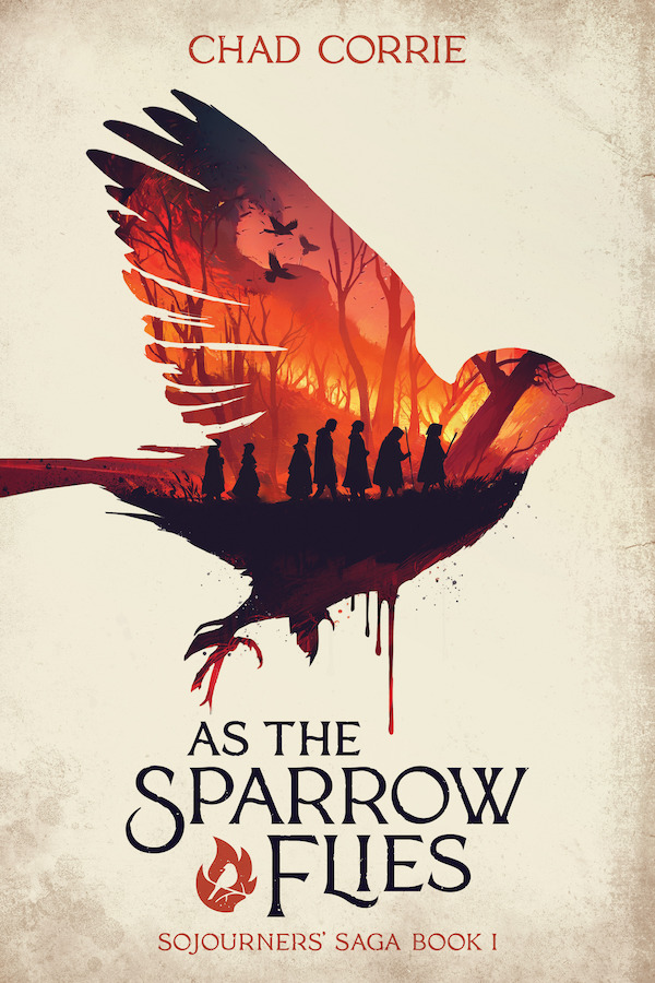
As we near the release of As the Sparrow Flies, Chad Corrie’s first book in his YA dystopian fantasy series: Sojourners’ Saga, we reached out to Dan Burgess, the artist for the series to share more about what went into making this particular cover.
Dan is an accomplished illustrator and artist when he isn’t keeping busy in his animation day job.As you’ve probably already noticed, his unique style works to wonderfully blend the story’s narrative with the emotional themes and elements within the setting to really grab the eye—something he’s looking to continue with the rest of the series.
And speaking of stories, Dan, you’re known for reading a story before creating cover art. When it came to this title what were some of the main elements/themes you wanted to showcase?
As The Sparrow Flies is a fantastic read. Right from the start, it captivates with intriguing mysteries and the sense of an epic, perilous journey about to unfold. I aimed to capture this essence for the book’s cover: the sense of a journey fraught with danger. That’s why I chose to depict characters traveling across a landscape that could be interpreted as either a beautiful environment or a burning forest.
What are some of the main challenges you’ve encountered in crafting cover art in general?
One common challenge I face in creating cover art is striking a balance between showcasing the book’s themes and elements without revealing too much. My goal is to attract readers and offer them something exciting, yet without giving away any crucial details.
That can certainly be a challenging tight rope to walk. Was there anything that challenged you in particular and/or something you rather enjoyed about this piece?
This cover adopts a minimalist aesthetic in many ways, utilizing strong, bold shapes contrasted against more detailed areas to enhance the graphic elements. This approach presented a challenge, yet it was also one of the most enjoyable aspects of the design.
It certainly has a rather iconic look to it. How did you come up with the idea for the sparrow imagery?
The concept for the sparrow imagery emerged from discussions with Chad and through experimenting with various sketches. Additionally, the visual representation of the sparrow is a quite literal interpretation of the book’s title, and it felt appropriate to include something so striking.
This will be the third book you worked on with Chad Corrie. While it was for three different tales, do you find it easier returning to provide cover art for stories from the same author?
I believe that each book I have worked on for Chad has been quite distinct, with a different approach for each cover. However, working directly with the author on the cover design significantly simplifies the process. This is particularly true as Chad often provides reference images, sketches, and detailed breakdowns of the book’s lore or his vision for the cover.
How did you find your way into making cover art? Was this the career path you originally set out to achieve?
I had never really considered book cover design as a career option. I was creating art for myself and sharing it online many years ago. Some of my works gained popularity, and I suppose a publisher noticed a few of my designs and decided to take a chance on me and my work.
Without giving too much away, was there anything you enjoyed/found of particular interest with As the Sparrow Flies?
I am fond of books that engage the reader by posing questions and setting up layers of mystery, hinting at larger aspects of the world and lore. This is something As The Sparrow Flies does exceptionally well.
Where can folks find out more about you and your work?
You can find my work at danburgess.art or on instagram at @danburgessart
Thank you, Dan, for your time!
As the Sparrow Flies hits stores and sites May 14th with preorders available in all formats.


